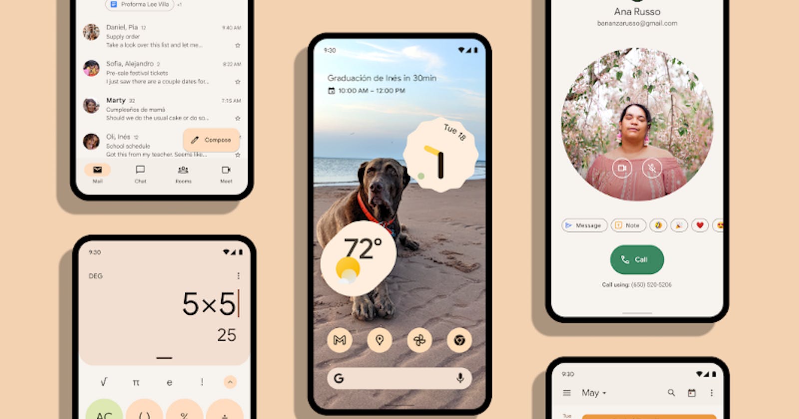


Android 12 offers a new Material theming known as ‘Material You’ - a dynamic colour scheme based on the phone’s wallpaper. Some colours will be extracted and applied as the accent colours for the entire phone
Material You — Android 12 from m3.material.io
Here see how the entire colour of the theme changed to brown as the wallpaper colour is somewhat brown!
So android has provided a way for the developers to adapt material 3 and dynamic colouring for their user interface some of the widgets are updated to be compatible with material 3, Let’s have a look at the updated widgets -
Buttons
Material Design includes 9 types of buttons which have been updated to adapt dynamic colouring

Buttons — from m3.material.io
Generally, a button is a UI element which triggers an action when someone activates the button, here the background colour, text and image outline colours are all dynamically changed based on the wallpaper, which is like creator's magic!
Text Fields
A Text Field or Text Box is a UI element allowing users to enter text. A text field is used in registration forms, login or signup pages...

Text Fields — from m3.material.io
Here the first textbox is filled and the second is outlined — the background colour, text colour and border colour inherit dynamic colour.
Switch
A Switch is a UI element used to toggle a particular thing on or off.
Switches— from m3.material.io
Here the colours of the switch, background and icon acquire dynamic colour from the material you theme
Radio Button
Radio Button allows users to select one option among a set of options available.
Radio Buttons — from m3.material.io
There are no many visual changes on the radio button but the colouring scheme has changed to Dynamic.
Slider
A slider allows users to select a value from a range of discrete or continuous values.
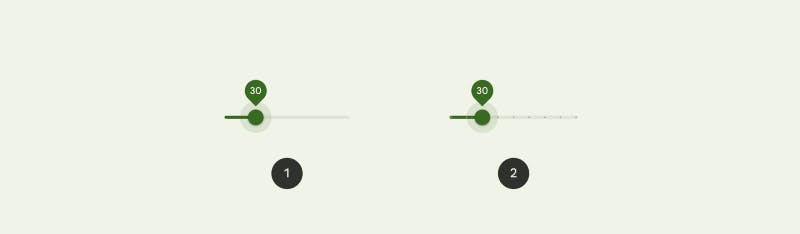
Slider — from m3.material.io
- It’s a Continuous slider — any value between the range can be selected.
- It’s a Discrete slider — any value from a predefined value can be selected within the range i.e there will be selection options at discrete locations in the range.
The colour of the slider is based on the material you.
Card
A card is a visual UI element which acts as a container for other UI elements — from images to headlines, supporting text, buttons, lists, and others to reside,
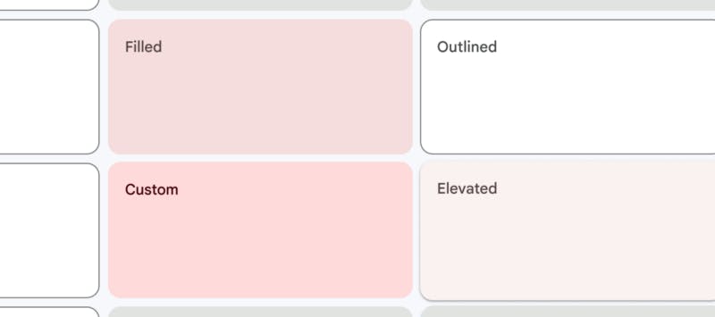
Cards — from m3.material.io
Here’s an example of a basic Material 3-supported application for demonstration :
This application is used to calculate Tip, after eating in the hotel and the elements used here are material 3 elements which follow dynamic colouring
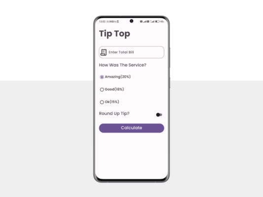
Example Application
Here we have used Text Field, Radio Button, Switch and Button. You can check this project on GitHub: https://github.com/sunkusaarthak/TipTop and try it out.
[GitHub TipTop: Basic Material 3 Application
You can check this basic-Material 3 application on GitHub…github.com](https://github.com/sunkusaarthak/TipTop "github.com/sunkusaarthak/TipTop")
Thanks for reading this article and staying till the end here with me, Hope I was able to share my valuable information with you.
Show your love by sharing this article with your fellow developers.
Follow me for more content about Android. If you have any questions, Contact me via sunkusaarthak@gmail.com