Components Jetpack Compose 🚀

I'm Sunku, a tech enthusiast who loves to learn, teach, and collaborate. I'm currently working on Android app development and learning data structures, currently pursuing a Bachelor's Degree in Computer Science.
Jetpack Compose is Android’s recommended modern toolkit for building native UI, It is an excellent alternative to XML code for defining the User Interface of the Android application.
Android Jetpack Compose
Jetpack Compose is built around composable functions. These functions let you define your app’s UI programmatically by describing how it should look and providing data dependencies, rather than focusing on the process of the UI’s construction (initializing an element, attaching it to a parent, etc.). To create a composable function, add the @Composable annotation to the function name.
Components of Jetpack Compose
Components are UI Elements which we use to build the user interface like texts, buttons, layouts…
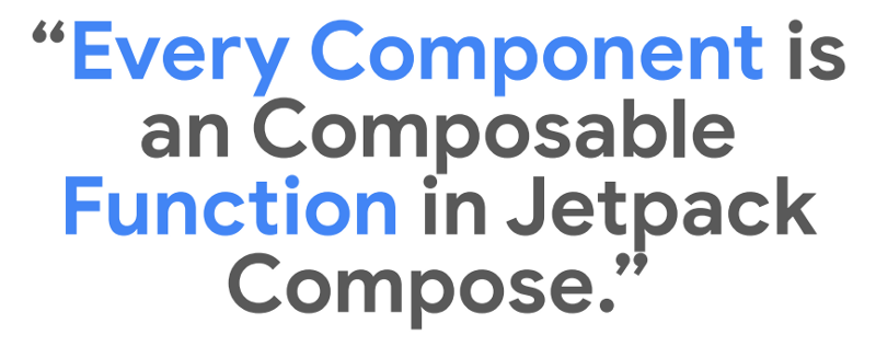
“Every Component is a Composable Function in Jetpack Compose.”
Text in Compose
Text and TextField are provided by Compose and are composable in accordance with Material Design principles. It is advised to utilise them since they have the proper appearance and feel for Android users and have additional features to make customising them easier without writing a lot of code.
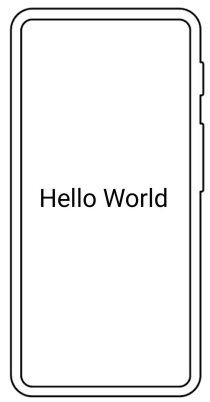
1. Simple Text
@Composable
fun SimpleText() {
    Text("Hello World")
}

2. Changing the text colour
@Composable
fun BlueText() {
    Text("Hello World", color = Color.Blue)
}

3. Making the text bold
@Composable
fun BoldText() {
    Text("Hello World", fontWeight = FontWeight.Bold)
}

Text alignments
The textAlign parameter allows setting the alignment of the text within a Text composable surface area.
@Preview(showBackground = true)
@Composable
fun CenterText() {
    Text("Hello World", textAlign = TextAlign.Center,
                modifier = Modifier.width(150.dp))
}
It is preferred to use TextAlign.start, TextAlign.end instead of TextAlign.left and TextAlign.Right because of languages texts.
Compose Modifiers
Modifiers let you enhance or enrich a composable. With the use of modifiers, you can: Change the size, layout, behaviour, and look of the composable. Include information, such as accessibility labels. Consider user input Include high-level interactions, such as enabling clickable, scrollable, draggable, or zoomable controls for elements.
Modifiers are typical objects in Kotlin. Call one of the Modifier class methods to create a modifier,
Example code below — for more details, Checkout the detailed documentation.
@Composable
fun ArtistCard(/\*...\*/) {
    val padding = 16.dp
    Column(
        Modifier
            .clickable(onClick = onClick)
            .padding(padding)
            .fillMaxWidth()
    ) {
        // rest of the implementation
    }
}

TextField Compose
Users are able to enter the text using TextField. TextField implementations may be divided into two categories:
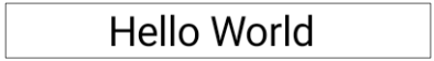
The default styling is filled
@Composable
fun SimpleFilledTextFieldSample() {
var text by remember { mutableStateOf("Hello") }
TextField(
    value = text,
    onValueChange = { text = it },
    label = { Text("Label") }
)
}
Outlined TextFeild
@Composable
fun SimpleOutlinedTextFieldSample() {
var text by remember { mutableStateOf("") }

OutlinedTextField(
    value = text,
    onValueChange = { text = it },
    label = { Text("Label") }
)
}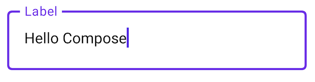
Button in Jetpack Compose
Buttons are interactive UI Elements and to work with Buttons in Jetpack Compose — You must supply two parameters for buttons in Jetpack Compose. OnClick callback is the first parameter, and your button text element is the second.
A Text-Composable or any other Composable can be added as a child element of the Button.
@Composable
fun SimpleButton() {
    Button(onClick = {
        //your onclick code here
    }) {
        Text(text = "Simple Button")
    }
}

We can have a handful of customizations with buttons and other elements of the jetpack compose
Column in Compose
You may put things inside a column since it is a composable function that accepts composable content. For instance, every child within a Column will be positioned vertically.

If we Don’t use any layout this will happen
@Composable
fun ArtistCard() {
    Text("Alfred Sisley")
    Text("3 minutes ago")
}

so, there is a definite need for layouts and one of the basic layouts is a column layout
@Composable
fun ArtistCard() {
    Column {
        Text("Alfred Sisley")
        Text("3 minutes ago")
    }
}

The UI tree is laid out in the layout model in a single pass. Size restrictions are sent down the tree to offspring after each node is requested to measure itself and any children it may have.
The resolved sizes and placement instructions are then transmitted back up the tree, after which leaf nodes are sized and positioned.
In a nutshell, parents are sized and put after their children yet are measured before them.
@Composable
fun SearchResult(...) {
  Row(...) {
    Image(...)
    Column(...) {
      Text(...)
      Text(..)
    }
  }
}
Here’s an example of a basic Jetpack Compose Application :
This Application uses the basic UI Elements Discussed above, Check out the GitHub Link below for the code

Most of the resources used in the above are directly taken from the official android developer's website.
https://developer.android.com/jetpack/compose
Thanks for reading this article and staying till the end here with me, Hope I was able to share my valuable information with you.
Show your love by sharing this article with your fellow developers.
Follow me for more content about Android. If you have any questions, Contact me via sunkusaarthak@gmail.com


